Introduction
Chromolithography is a technique that is both crucial in the history of art and printmaking and underwhelmingly undocumented at the same time. Extensive documentation has been done on the physical aspect of the technique: the type of limestone used as the inking surface; the chemistry behind desensitizing the ink image; and the transfer of the image onto the paper; steps were well-known and could be recreated in the modern setting given the right materials. What is lesser known is the technique and color theory that goes into creating the “perfect” layers of color that would overlay dozens of times with each other to recreate a duplicate of the original painting.
As chromolithography was prevalent in 19th century Europe, especially France, the methodology was passed down from mentor to apprentice—just like art itself, one can only recreate with a solid understanding of color theory and a keen eye for how colors mix, and how colors can separate. Paintings, or even any kind of image, can now be recreated with a simple scan using electronic technology; the science behind colors has been uncovered to reveal that there is a systemic way to separate colors in ways such as CMYK and RGB. However, the mystery behind chromolithography remains: instead of recreating the output, a reprint of a painting, is there a way to systemically recreate the color separation that is calculated within the artist’s eye?
I focused on recreating the steps of chromolithography through color extraction from the pixels of a digital image. In chromolithography, even determining the first step in choosing what base color to lay down, and where it would be overlayed in the painting, is extremely difficult for the untrained eye. Several sources, while rare, document the step-by-step process in the lithography process; one page would show the next color layer to be transferred, and the other page, the completed print so far with all the past layers overlaid. Louis Prang, one of the most well-known lithographers, did exactly this in his book Prang’s Prize Babies [1]. While impressive, Prang layers 18 different colors in the recreation of a painting with six babies across the canvas, which is too many steps for a non-artistic student like myself to follow precisely or analyze the process. A chromolithographic reprint’s value is directly correlated to the fine details that come through with duplicated layers of colors in different areas and order. Thus, I turned to a lesser-valued chromolithographic step process from an unidentified German school [2], which used just nine colors in succession. The general methodology between the two sources was similar—starting with neutral colors such as beige (skin), yellow, and gray, areas became increasingly thinner and more precise as the colors became sharper and richer, such as red, navy, and black.
Rainbow Separation
To start, I referenced documentation on the Matplotlib library to get a sense of color separation in Python [3], For testing purposes, I began with a simple rainbow stock image (Fig. 1).
 Figure 1: rainbow.jpg
In following an Educative tutorial [4], I was able to execute a simple RGB-splitting program using the rainbow (Fig. 2).
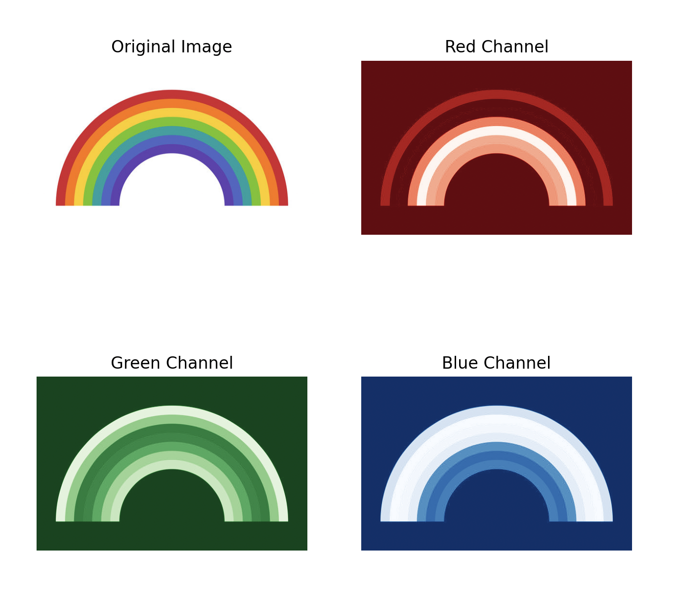 Figure 2: RGB channel splitting
The goal was to split the rainbow into seven colors, corresponding to each layer in the rainbow. This increased simplicity and would provide a framework for color extraction in complex painting inputs. Experimenting with pixel-by-pixel comparison with the eyedropper-picked red RGB(211, 35, 46), the following red layer could be extracted (Fig. 3):
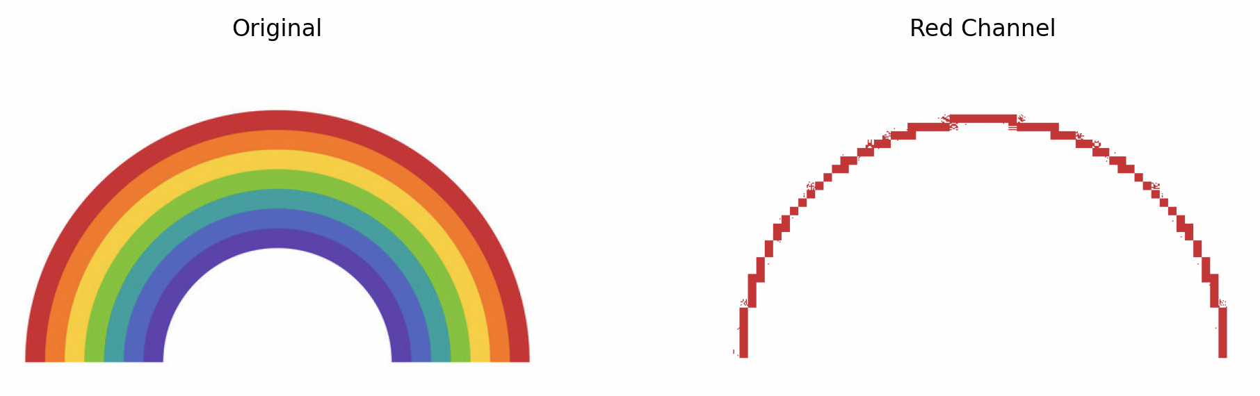 Figure 3: Initial red channel separation from the rainbow
The pseudocode for separating a color is shown in Table 1 along with some extra steps. Seeing the extraction, it can be a bit confusing as to why the red channel is so pixelated when the original shows a smooth curve. Further examination at the image shows that the red layer to the rainbow is in fact not a solid color, but is distorted and pixelated (Fig. 4).
 Figure 4: Close-up of rainbow.jpg
Therefore, the RGB range for which the pixel is “part” of a color extraction is increased using the variable cerror (color error difference).
M = original image (array representation)
red_M = copy of M
ref_RGB(R, G, B) = reference color to extract

for each pixel in the image:
    if(pixel_RGB(r, g, b) is within
       ref_RGB(R ± cerror, G ± cerror, B ± cerror):
            red_M(pixel) = M(pixel)
    else:
            red_M(pixel) = white

show red_M as image
Table 1: Pseudocode for red extraction from rainbow using cerror
Fig. 5-7 shows the increasing inclusion of red pixels as cerror increases. As a continuation of Fig. 7’s optimal error value, all seven colors were then able to be extracted cleanly in separate channels (Fig. 8).
 Figure 5: Red extraction with
 cerror = 5
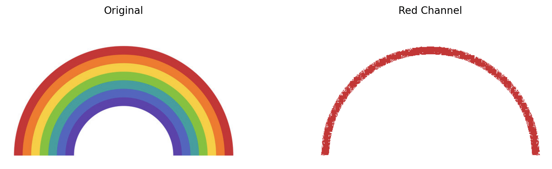 Figure 6: Red extraction with
 cerror = 10
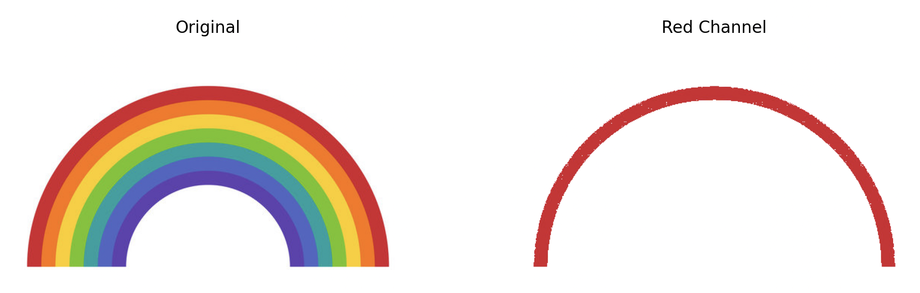 Figure 7: Red extraction with
 cerror = 20
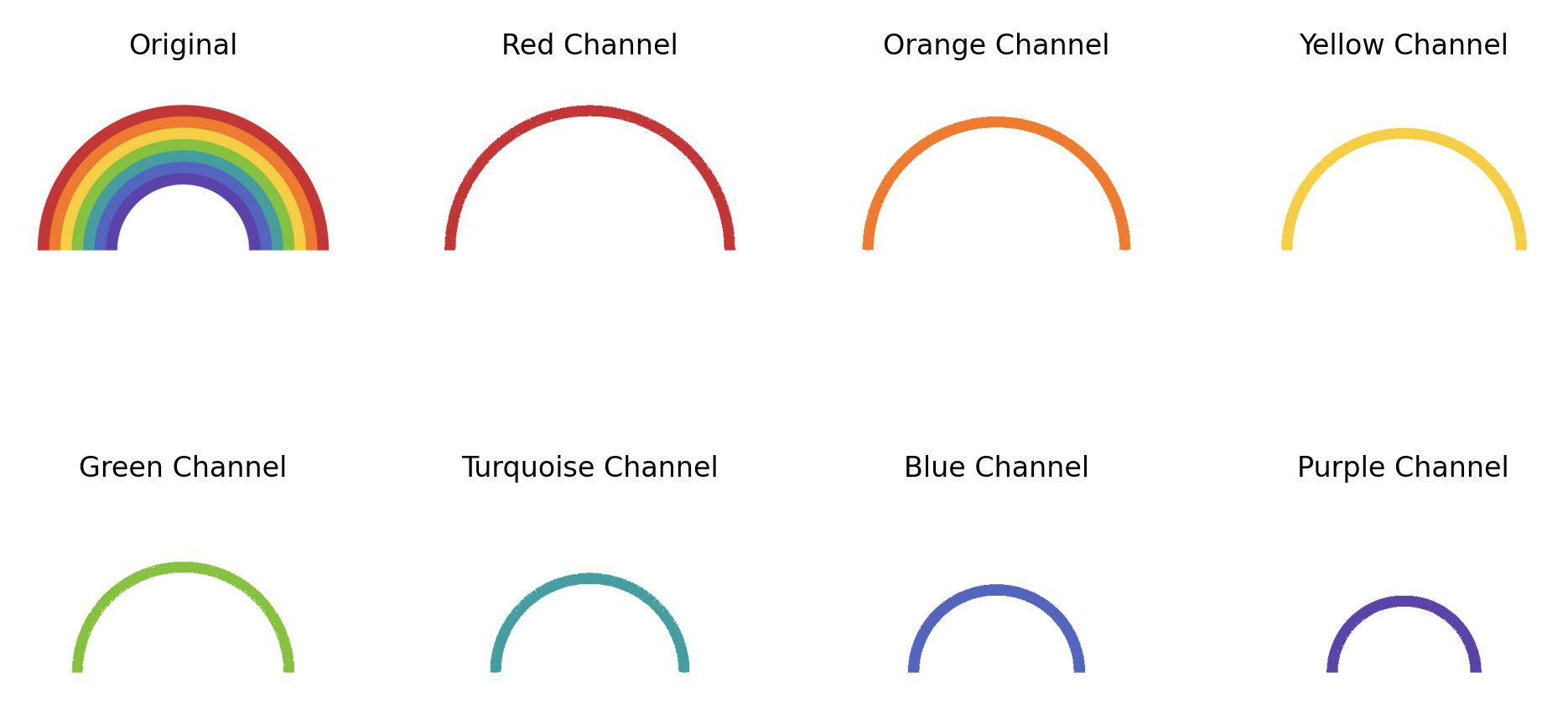 Figure 8: 7-color extraction with
 cerror = 20
Extraction from Complex Paintings
At this point, the color extraction process can be applied to paintings, returning to the original goal to simulate chromolithography. The variable cerror plays a huge factor, as it can be used to determine if a certain color “exists” within a pixel. In other words, the broader the cerror, the more lenient the program is in deciding that a pixel should be included in a specific “coloring” process (e.g. lithographic layer).
The palette that the program uses is a 9-color palette that is pulled directly from a chromolithograph printing process by an unknown German school. It consists of beige (fleischton), yellow (gelb), brown (braun), light blue (I. blau), light red (I. rot), blue (II. blau), light gray (I. grau), red (II. rot), and dark gray (II. grau). Extracting Grant Wood’s American Gothic (1930) (Fig. 9) with these nine colors gives varying results depending on the cerror (Fig. 10, 11).
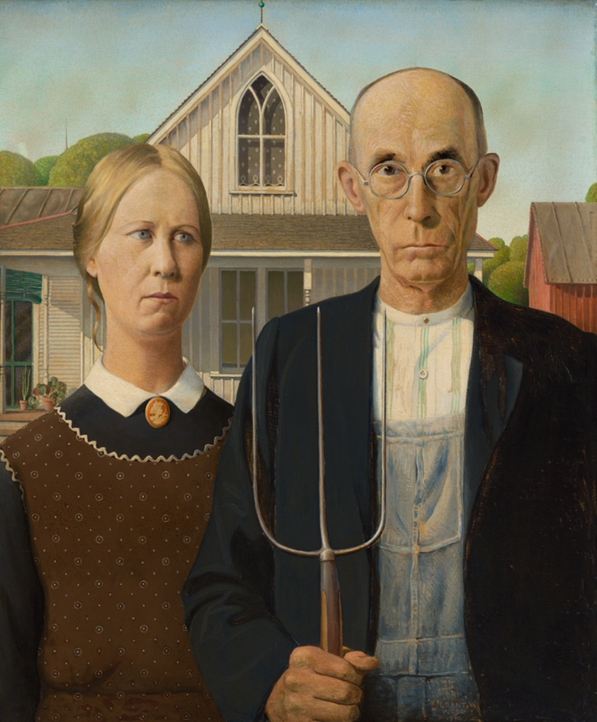 Figure 9: American Gothic (1930) by Grant Wood [5]
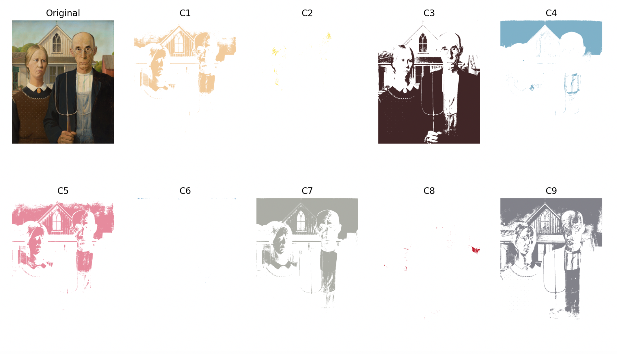 Figure 10: 9-color extraction of American Gothic with
 cerror = 64
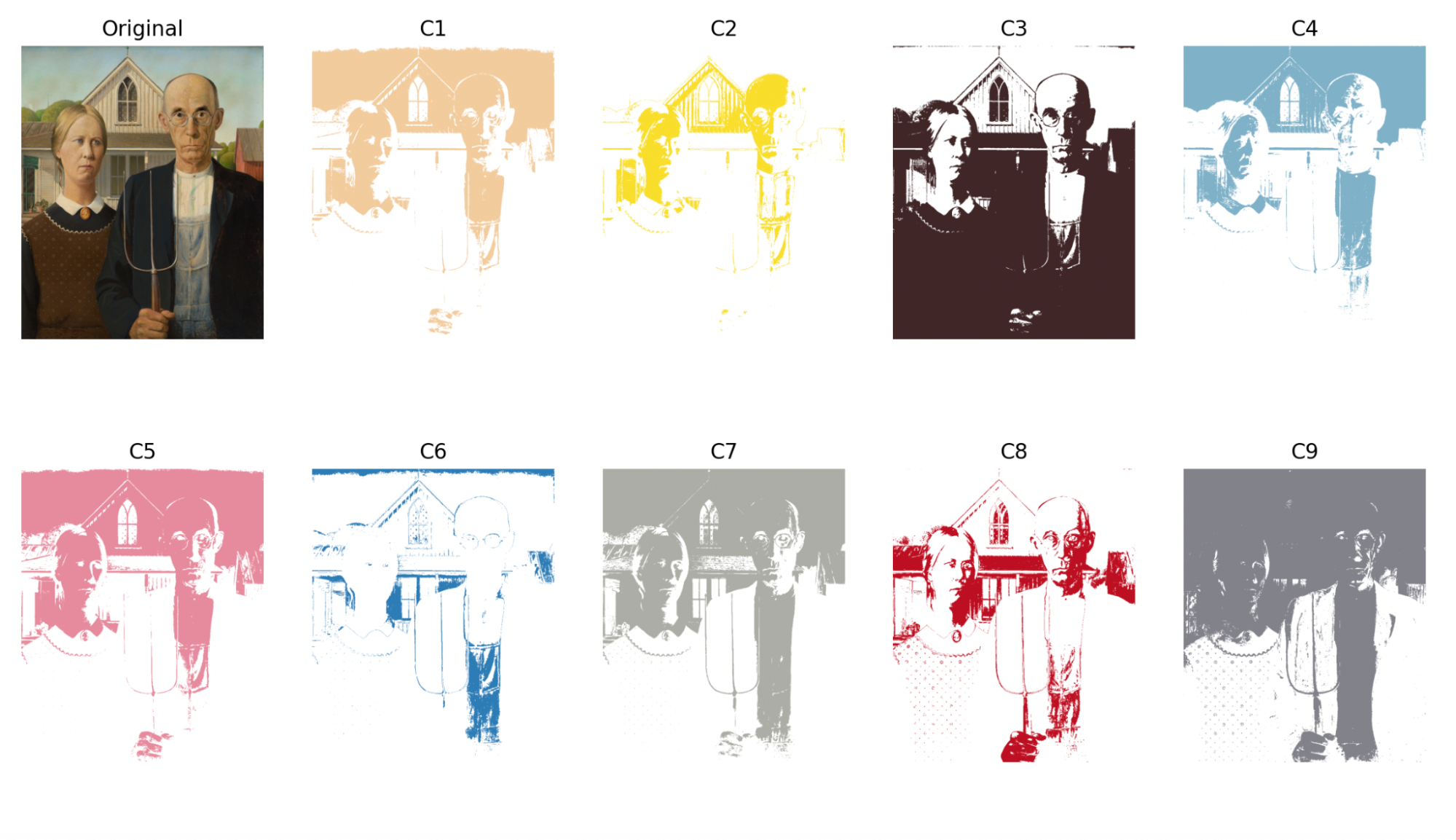 Figure 11: 9-color extraction of American Gothic with
 cerror = 100
Two other paintings were extracted in the same manner (Fig. 12, 13).
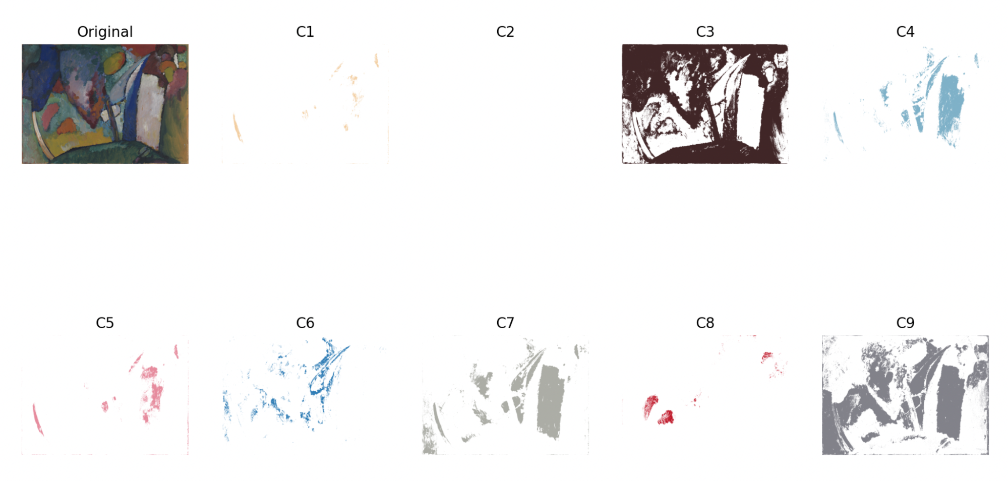 Figure 12: 9-color extraction of The Waterfall (1909) by Wassily Kandinsky with
 cerror = 64 [6]
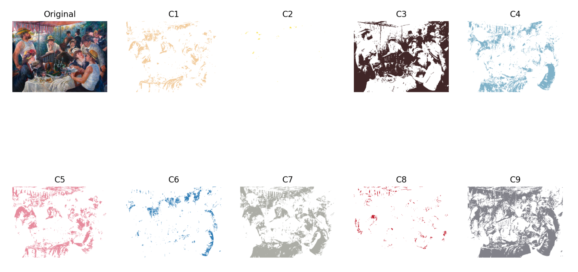 Figure 13: 9-color extraction of Luncheon of the Boating Party (1880-81) by Pierre-Auguste Renoir with
 cerror = 64 [7]
In Fig. 12 and 13, it is inherent that the 9-color palette from the German school chromolithograph does not work nearly as well as it does to the specific painting that it was chosen for. Therefore, using an online palette generator, Luncheon of the Boating Party is re-extracted using a new 9-color palette (Fig. 14, 15).
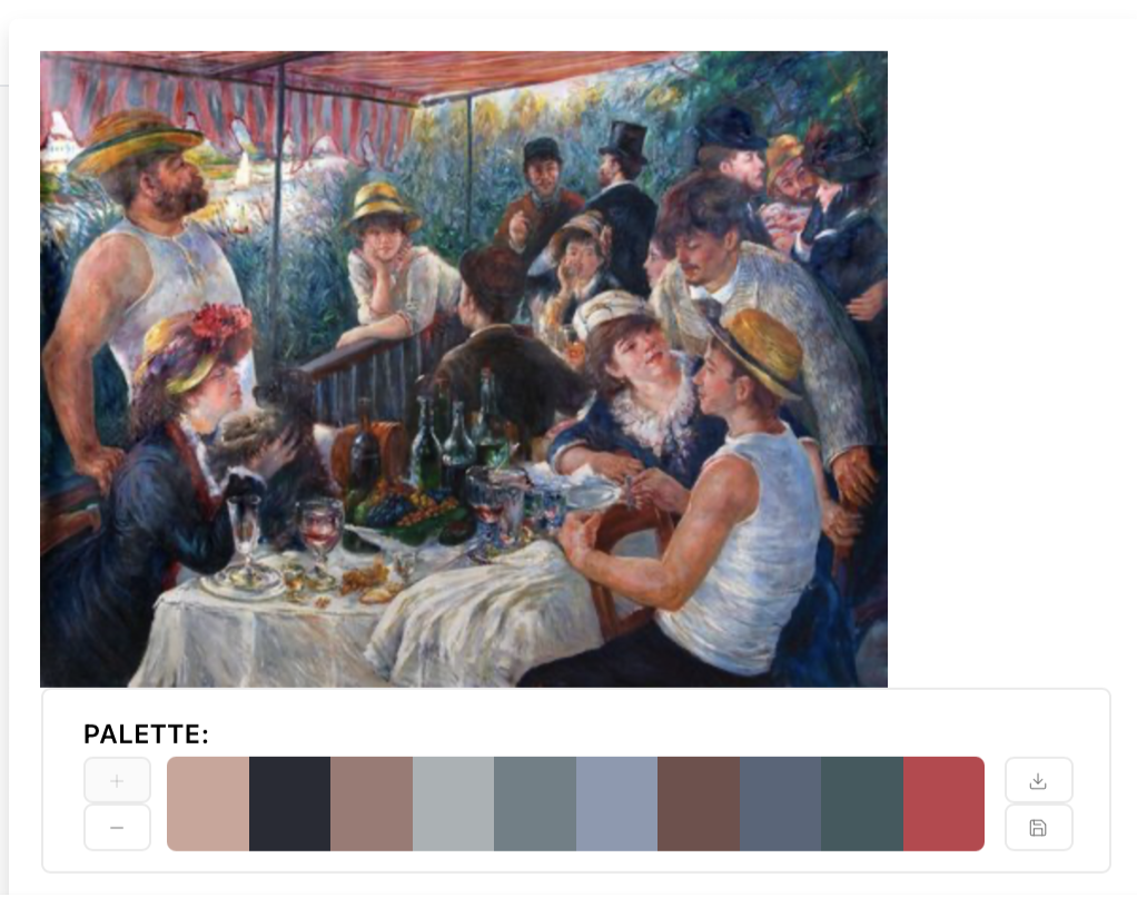 Figure 14: 10-color palette generated from the Luncheon of the Boating Party. The 7th color (dark blue-gray) will be removed for simplicity purposes.
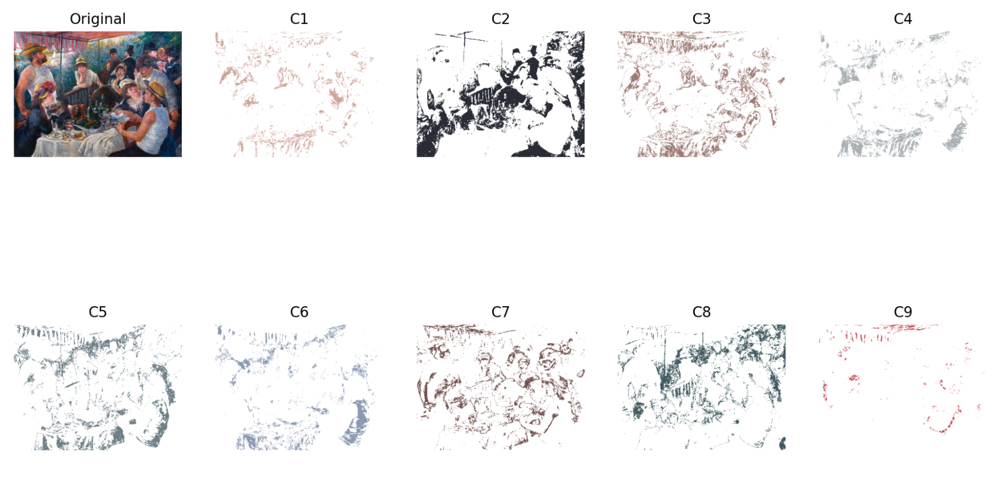 Figure 15: New 9-color extraction of Luncheon of the Boating Party with
 cerror = 32
Even with a lower cerror, it is evident that the painting-specific palette generates a much more exhaustive and cleaner extraction than the former. The same process is applied to the Waterfall (Fig. 16).
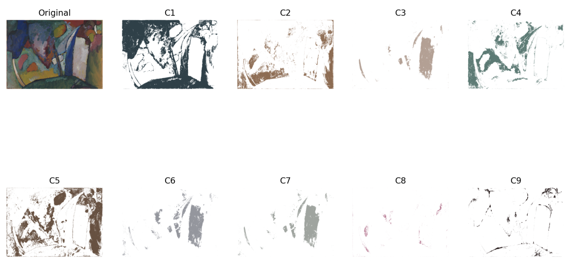 Figure 16: New 9-color extraction of The Waterfall with
 cerror = 32
Kandinsky’s The Waterfall is a simpler model compared to the Luncheon of the Boating Party due to its abstract use of colors in larger, solid blocks. In the extraction process, it is clear that this is a representative, albeit crude, model of chromolithography—C2, C5, and C8 highlights red-brown areas, C1 and C9 outlines the painting with black and blue (waterfall) areas, C4 fills in the greenland, and C3, C6, and C7 closes the gray gaps in between as well as deepening the shadows of other areas.
Future Steps
First things first, one of the biggest things I discovered was that applying one color palette (such as the German school’s 9-color palette) to every single painting did not yield favorable results. For example, the same palette that worked well for American Gothic gave almost no results for The Waterfall, given the lack of certain colors such as bright yellow and beige in Kandinsky’s painting. Thus, I looked for online palette creators that extracted the most frequently used colors in an uploaded image and returned a palette; in this way, I was able to improve upon The Waterfall and Luncheon of the Boating Party’s color extractions.
The second problem I came across was the lack of full coverage of the painting, as well as the uneven distribution of each color’s weight. This was the main reason why I was unable to actually overlay the separate images to recreate the painting, as I did not have the technical skillset to delve into the scientific reasoning behind color mixing and opacity weights. The margin error that I used in color extraction, cerror, applied to all colors in the palette; thus, the color dark brown could be used overwhelmingly in an overall dark-valued painting, while beige could be used very little. However, in reality, with the layering of the rest of the colors, the actual color brown could be used a lot less in amount as well as the intensity of the brown. In Louis Prang’s Babies, the color black is used very, very sparingly; instead, Prang layers multiple layers of gray. This would also give a three-dimensional effect and allow the chromolithographer finer control over which areas could be darker than others.
A way I can overcome this problem is to apply a different cerror to each color in the palette, as well as adjust the opacity on an RGBA scale instead of an RGB scale. However, this would also require much more detailed work to be done on painting-specific factors such as its specific color palette and areas of values. Since my goal was to create a more broadly systemic method of color extraction to simulate crude chromolithography, I leave this as a note as a future step.
Code
All code can be found in my Github repository
(final version to run: chromolithography.py)
Sources
[1] https://www.americanantiquarian.org/prang
[2] https://www.meisterdrucke.ie/fine-art-prints/German-School/942108/Chromolithography-printing-process.html
[3] https://matplotlib.org/stable/api/_as_gen/matplotlib.pyplot.imshow.html
[4] https://www.educative.io/answers/splitting-rgb-channels-in-python#
[5] https://www.artic.edu/artworks/6565/american-gothic
[6] https://artgallery.yale.edu/collections/objects/43994
[7] https://www.phillipscollection.org/collection/luncheon-boating-party